11.6
The footer
The footer lives at the end of each page (before the closing </body> tag). The footer is identical for every page. It looks like this:

The footer is everything below the white central area (with the slight cream colour). The footer does the following things:
It provides a border that terminates the white central area following the sections
It provides links to common sections of the website and a quick link back to the top of the page
All the links in the footer animate, the common links are underlined when the mouse hovers over the link:

It is pretty easy, and even better, short.
Here’s the HTML, I’ve shown it in relation to the </body> and </html> elements that end the page:
<!-- ************************************************************************** [WP FOOTER] FOOTER ***********************************************************************--> <footer class="footer"> <!-- Start of footer --> <ul class="footer-nav"> <!-- Start of footer nav --> <li><a class="js--sc-000000" href="#"><span class="top-nav-icon" style="color:#5b7daf">t</span>Top</a><span class="footer-spacer">◇</span></li> <li><a href="80-00-finally.html#js--800100">Contact MG</a><span class="footer-spacer">◇</span></li> <li><a href="80-00-finally.html#js--800200">Acknowledgments</a><span class="footer-spacer">◇</span></li> <li><a href="80-00-finally.html#js--800300">Colophon</a><span class="footer-spacer">◇</span></li> <li><a href="80-00-finally.html#js--800400">Legal & Privacy</a></li> </ul> <!-- End of footer nav --> </footer> <!-- End of footer --> <!-- ========================================================================== [WP END] --> </body>
And the CSS:
.footer {                                  /* footer row */
    margin-bottom: 0;
    margin-left: -1px;                     /* offset start to cover body left border */
    width: 100.16%;                        /* make wider than body to cover borders */
    padding-top: 15px;
    padding-bottom: 0;
    background-color: #fbfaf6;
    font-family: "conc-t3-r";
    font-feature-settings: "ss02";
    font-size: 0.85rem;
    line-height: 100%;
    border-top: 1px solid #ebebeb
 }
.footer-spacer {                            /* spacing between navigation entries */
    margin-left:2rem;
    font-size: 0.8rem;
}

.footer-nav {                               /* container for footer navigation list */
    list-style: none;
    text-align: center;
}

.footer-nav li {                            /* format list elements */
    display: inline;
    margin-left:2rem;
    color: #4C6C9C;
}
.footer-nav li:first-child {                /* remove left margin from first nav link */
    margin-left: 0;
}
.footer-nav li a:link,                      /* format anchor properties */
.footer-nav li a:visited {
    color: #4C6C9C;
    text-decoration: none;
    border-bottom: 1px solid transparent;
    transition: border-bottom 0.2s;}
.footer-nav li a:hover,
.footer-nav li a:active {
    border-bottom: 2px solid #5b7daf;
}
The footer starts with the <footer> semantic element and this is given the class footer.
<footer class="footer">
The footer is a wrapper for the whole footer and its class defines the basic properties for things within the footer (fonts, background colour &c.). It starts with something peculiar though:
    margin-bottom: 0;
    margin-left: -1px;         /* offset start to cover body left border */
    width: 100.16%;            /* make wider than body to cover borders */
The first bit is OK, it just sets the bottom margin to zero (there is no gap after the footer). The next bit is the odd bit; I’ve set the left margin to -1 pixel and then set the width to be 100.16%.
The reason for this becomes obvious if I set the margin to zero and the width to 100% (what you would think is the normal setting). If I do this I get:

It’s the border at the edges; it’s hard to see in the above so I’ve enlarged it below:
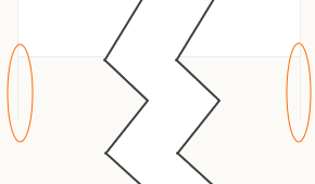
The problem is the left and right borders (highlighted in orange), these borders are the ones defined ages ago when we set up the body style (§ 7.4.3)
body {
    max-width: 1276px;
    height: 1000px;
    margin: 0 auto;
    background-color: #fff;                   /* make content area white */
    border-left:  1px solid #ededed;
    border-right: 1px solid #ededed;
}
There is a 1 pixel wide border to the left and right of everything within the <body>...</body> elements and since the footer is within the body element it gets the border too.
Now, I don’t want the border lines at the side of the footer, I want the footer to draw a border at the top that completes the page.
To get round this, I make the footer start 1 pixel to the left (hence the margin-left: -1px), this moves the footer over the border defined by the body class, hiding it.
The problem now is that if the footer starts one pixel to the left and has a width of 100%; it will finish one pixel before the right border. I need to make it two pixels wider than this (to cover the right border as well), at the maximum page width of 1276 pixels, 2 pixels is 0.16%; so I need to make the footer width 100.16% and that is what I have done:
    margin-left: -1px;          /* offset start to cover body left border */
    width: 100.16%;             /* make wider than body to cover borders */
It’s a bit fiddly but it works.
The rest of the footer style is more boiler plate:
    padding-top: 15px;
    padding-bottom: 0;
    background-color: #fbfaf6;
    font-family: "conc-t3-r";
    font-feature-settings: "ss02";
    font-size: 0.85rem;
    line-height: 100%;
    border-top: 1px solid #ebebeb
I’ve added some padding at the top to give a gap between the last section of the page and the footer links, there is no padding at the bottom.
The background colour is set to #fbfaf6; this is the same colour as the borders outside the page area (defined in the <html> class). This makes the web page look finished, the white body text area stops and is finished at the bottom with an area that is the same colour as the outside edges — it looks right.
Next is the usual text properties, it’s all Concourse with the British stylistic set, the font size is 0.85 rem and the line height is set to 100%.
Finally, I give the footer a top border, 1 pixel high in the same colour as the left and right borders of the body area (#ebebeb); again this is just to finish the page properly.
By itself it just finishes the page off, it looks like this:
If that’s all you want, all you need is:
        <footer class="footer"></footer>
    </body>
</html>
To add the five basic links:
Top
Contacts
Acknowledgements
Colophon
Legal & privacy
Then another unordered list is needed. This is fairly similar to the TOC in the previous section. The HTML is:
<ul class="footer-nav"> <!-- Start of footer nav --> <li><a class="js--sc-000000" href="#"><span class="top-nav-icon" style="color:#4C6C9C">t</span>Top</a><span class="footer-spacer">◇</span></li> <li><a href="80-00-finally.html#js--800100">Contact MG</a><span class="footer-spacer">◇</span></li> <li><a href="80-00-finally.html#js--800200">Acknowledgments</a><span class="footer-spacer">◇</span></li> <li><a href="80-00-finally.html#js--800300">Colophon</a><span class="footer-spacer">◇</span></li> <li><a href="80-00-finally.html#js--800400">Legal & Privacy</a></li> </ul> <!-- End of footer nav -->
The unordered list is of class footer-nav:
<ul class="footer-nav">
footer-nav has the same function as toc-line and toc-list in the previous section:
The basic footer-nav removes the bullet points from the list entries (list-style: none) and centre aligns the text within it (text-align: center).
.footer-nav {                               /* container for footer navigation list */
    list-style: none;
    text-align: center;
}
Next comes the basic properties for the list entries themselves:
.footer-nav li {                            /* format list elements */
    display: inline;
    margin-left:2rem;
    color: #4C6C9C;
}
.footer-nav li:first-child {                /* remove left margin from first nav link */
    margin-left: 0;
}
This is slightly different; I’ve set the list to be inline, not inline-block. The reason for this is that I don’t want to specify a width for the list elements; I want them to be just as wide as the text they contain (plus a left margin), other than that they behave the same, the all stack up next to each other on the same line.
The left margin of 2 rem is used to space the entries. This margin is the gap between the lozenge character (◊) and the following link (to the right) is 48 px at the maximum screen width.
The left margin is qualified by the first-child pseudo class,
.footer-nav li:first-child {                /* remove left margin from first nav link */
    margin-left: 0;
}
The first (left most) link does not follow a lozenge character and it doesn’t need a margin at the left, hence the pseudo-class removes the margin from the first list entry.
Finally, the link text colour is set to a blue colour (#4c6c9c), same blue as the TOC entries.
The footer-nav is also used to define the appearance of the links contained in each list entry:
.footer-nav li a:link,                      /* format anchor properties */
.footer-nav li a:visited {
    color: #4C6C9C;
    text-decoration: none;
    border-bottom: 1px solid transparent;
    transition: border-bottom 0.2s;}
.footer-nav li a:hover,
.footer-nav li a:active {
    border-bottom: 2px solid #5b7daf;
}
The links have no text decoration
text-decoration: none;
The link text colour is set to the same standard blue under all circumstances:
color: #4C6C9C;
The :link and :visited text is given a transparent bottom border (this does not show on the screen)
border-bottom: 1px solid transparent;
And a transition condition is added to fade in the bottom border when a mouse is hovered over the link:
transition: border-bottom 0.2s;
The :hover and :active links just apply the bottom border:
border-bottom: 2px solid #5b7daf;
The bottom border is 2 pixels high and is in a slightly lighter (but complementary) blue.
Back to the HTML to join it together:
<li><a class="js--sc-000000" href="#"><span class="top-nav-icon" style="color:#4C6C9C">t</span>Top</a><span class="footer-spacer">◇</span></li>
The first class js--sc-000000 is again used for slow scrolling (see section 17), in this case it is the ID at the very top of the current web page.
The href="#" is a place holder, it effectively means a link to a point (an ID) on the current page, again this is to do with the slow scrolling in section 17. For the time being just accept that it works.
This is followed by the text that is to be the visible link text. The first link (above) has the text . The up arrow is part of my icon font (PS Icons) and is used in exactly the same way as it was in the nav bar (§ 11.3.3). The font is selected by using a <span> element of class top-nav-icon (again see § 11.3.3). This time I’ve applied a qualifying style directly in the HTML:
<span class="top-nav-icon" style="color:#4C6C9C">t</span>
The style="color:#4C6C9C" applies CSS code directly in the HTML. This is one of the mechanisms for applying CSS that I discussed right at the start in § 5.3. I’ve used it here to change the colour applied in top-nav-icon (this was a light grey inherited from its parent class) to the same blue as the link text.
Doing it this way, the style property overrides any colour set in the CSS. It is a useful technique for manipulating individual properties of a style — use it sparingly though; if you are using it everywhere, you should define another class.
The rest of the first link is just standard text with the word “Top” and this is followed by the closing link </a>.
There is one more thing; the link is followed by another <span> element:
<span class="footer-spacer">◇</span></li>
You may be wondering what ◇ means.
Well, it is a way of entering special character in HTML. I explain how to use special characters in HTML in § 6.11. I’ll give a quick explanation here.
All fonts have special characters that are not available via keys on the key board. In Word, they are called symbols and are added by pressing the button ().
In HTML, any character can be entered by using its character code. HTML character codes are preceded by the ampersand and hash characters (&#) and finished with a semicolon (;).
The character codes for all characters are predefined and standard; they are based on the original ASCII character set and then expanded with the use of Unicode characters.
The character code for the letter “A” is 65 (decimal).
To enter the letter “A” in HTML using character code, use the following:
A
Character codes can also be entered using hexadecimal notation (just like Mark Watney in the Martian). I cover hexadecimals in (§ 5.7.1)
The hexadecimal for 65 is 41 and in HTML this would be:
A
To use hexadecimal character codes, the hex number is preceded by &#x.
In the footer I’m using the hexadecimal character code ◇ this displays the lozenge character (◊). The same character in decimal is ◇.
In this particular instance I’ve enclosed the lozenge character in a <span> with class footer-spacer. This has the following CSS:
.footer-spacer {                  /* spacing between navigation entries */
    margin-left:2rem;
    font-size: 0.8rem;
}
Not much too it, it just separates the lozenge from the preceding text by 2 rem:
margin-left:2rem;
And sets the font size to 0.8 rem (slightly smaller than the text, again this just looks right).
The remaining links all have the following format (this example is for contact):
<li><a href="80-00-finally.html#js--800100">Contact MG</a><span class="footer-spacer">◇</span></li>
It’s identical in structure to the first (Top) link, but it doesn’t have the PS-Icon character and the link is to a point on a different web page (ID js--800100 on web page 80-00-finally.html). In my case, all the remaining links point to the same web page (80-00-finally.html), just to different points on that page.
Each link apart from the last is followed by a lozenge separator.
