I need to backtrack a little here, there’s some stuff to do with links that I haven’t covered yet, and although I looked at links very briefly in § 5.2 they just had that standard web page appearance that has been around since the 90s:
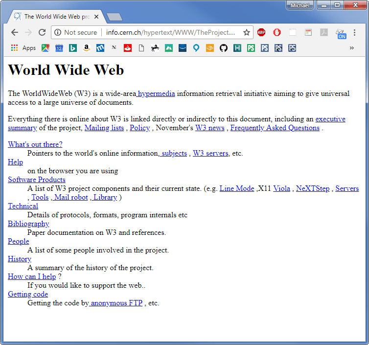
Figure 11.3 The very first website (apparently)
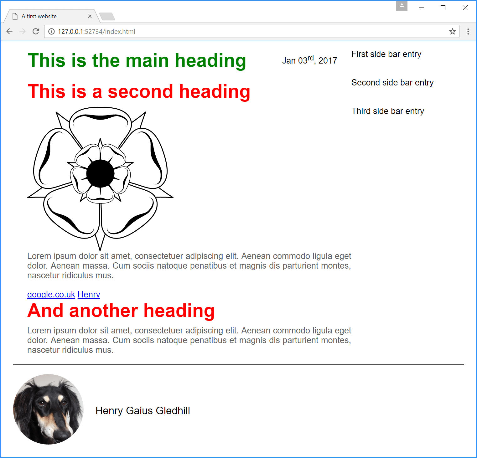
I.e. the links are all underlined and are in blue; these turn purple if I’ve already clicked the link. And that’s exactly what I had in first-site example that was built in sections 5 and 6. It looked like this if you remember:
Figure 11.4 My final first-site website from section 6
The two links google.co.uk and Henry have exactly that appearance.
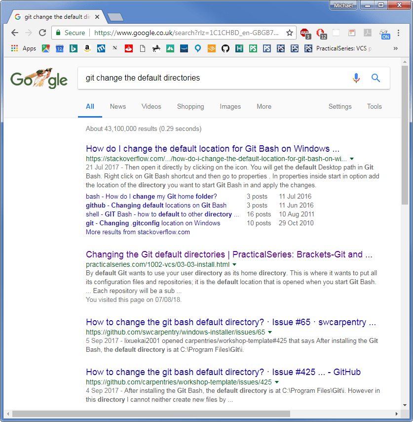
Nowadays, websites have moved on and this blue, underlined link is nowhere to be seen — except Google, they still use it (or something very similar):
Figure 11.5 Links in google
Hey, that’s my site (second one down).
So how do we get rid of it?
Well, CSS allows us to modify the styles applied to a link (and other elements) when we do different things to it — e.g. hover a mouse over it, click it &c.
11.2.1
:link, :visited, :hover and :active selectors
These selectors are most commonly applied to the anchor element <a ...> which, if you remember is used to provide links on a web page.
There are four of these:
a:link
a normal, unvisited link
a:visited
a link the user has already visited
a:hover
a link when the user moves the mouse over it (but doesn’t click)
a:active
a link at the moment it is clicked (and while the mouse button is pressed)
To demonstrate, let’s take our basic web page and put a link in it. The basic web page currently has the following:
html
<!DOCTYPE html> <!-- HTML 5 file -->
<html lang="en"> <!-- Declare language -->
<head> <!-- Start of head section -->
<meta charset="utf-8"> <!-- Use unicode char set (< 1024 char from SOF) -->
<meta name="viewport" content="width=device-width, initial-scale=1.0">
<!-- **************************************************************************
HEAD CSS LOAD
***********************************************************************-->
<link rel="stylesheet" type="text/css" href="21-global/03-fonts/ps-fonts.css">
<link rel="stylesheet" type="text/css" href="21-global/01-css/normalise.css">
<link rel="stylesheet" type="text/css" href="11-resources/01-css/grid.css">
<link rel="stylesheet" type="text/css" href="11-resources/01-css/style.css">
<!-- **************************************************************************
TITLE
***********************************************************************-->
<title>A work in progress | PracticalSeries: Web Development</title>
</head>
<body>
<!-- ************************************************************************** [WP HEADER]
HEADER
***********************************************************************-->
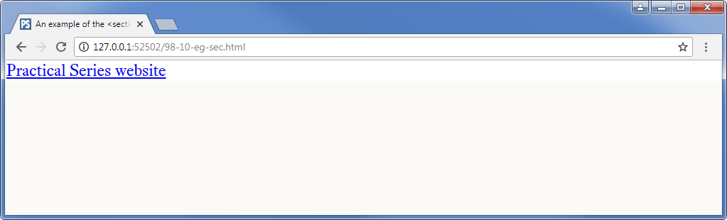
<header id="js--000000">
<a href="https://practicalseries.com">Practical Series website</a>
</header> <!-- End of header -->
<!-- ========================================================================== [WP END] -->
</body>
</html>
Code 11.2 A single link on the web page
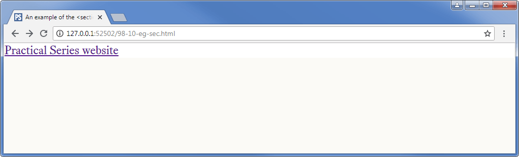
I’ve added a <header> section with a link in it.
It looks like this:
Figure 11.6 Basic link on a web page
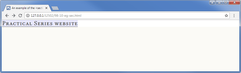
And if the link is clicked and the back key pressed it looks like this:
Figure 11.7 Basic visited link on a web page
It goes from blue to purple if the site has been visited (i.e. is in the web browsers history).
Right, all well and good, very Tim Berners-Lee. Now let’s tinker with it a bit; we’ll do this in CSS, specifically in style.css. Add the following (near the start after the body definition).
style.css
body {
    max-width: 1276px;
    margin: 0 auto;
    background-color: #fff;                 /* make content area background white */
    border-left: 1px solid #ededed;
    border-right: 1px solid #ededed;
}


a:link {
    font-family: 'conc-t3-r';
    text-decoration: none;
    color: #4C6C9C;
}
Code 11.3 Basic link selector
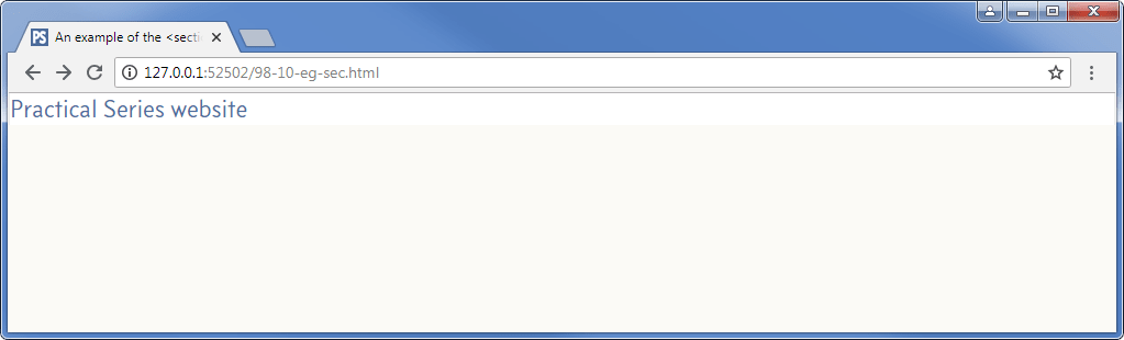
This changes the font to Concourse in a different blue colour and removes the underline.
Most of these properties you have seen before (font-family and color), the
text-decoration: none;
text-decoration property is responsible for changing the underlining arrangements (none stops all decorations, other options are line-through, overline and underline; you can guess what they do)
Figure 11.8 Modified link property
Now, only the :link selector has changed, but if you hover a mouse over the link or click it and go back to the page, you will see that while the colour changes, some other properties don’t, it remains in the concourse font and the underlining doesn’t come back. This is because the :link defines various properties that are inherited by the other selectors; color however is an exception, it has to be defined for each selector.
Code 11.4 Link, visited, hover and active selectors
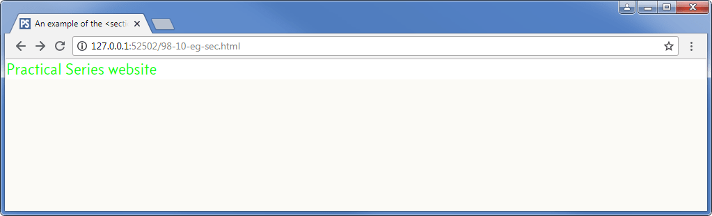
The basic (unclicked link) looks the same as before (Figure 11.8), however if you hover the mouse over the link you get a green link:
Figure 11.9 Modified hover property
Click the link and hold down the mouse button, this turns the link black:
Figure 11.10 Modified active property
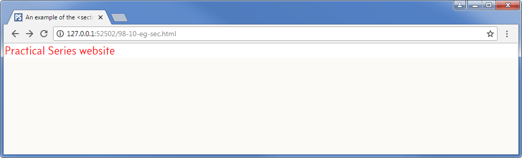
And finally, if you click the link (it will take you to a new page) and then hit the back button (alt+left cursor key), the visited link will be red:
Figure 11.11 Modified visited property
These selectors (or more properly pseudo-classes) have certain rules:
:visited must come after :link and can only modify properties defined in :link†1
:hover must come after :link and :visited
:active must come after :hover
†1
This is a privacy issue; a malicious website could test the visual style of a link with JavaScript to report back to a server which sites the user has visited, violating the user’s privacy.
In practice, these four selectors tend to get grouped into pairs; :link and :visited are usually grouped together and :hover and :activeare grouped together. As follows:
Code 11.5 Link, visited, hover and active selectors
This now gives a fairly consistent approach to links, the basic link looks like this:
Figure 11.12 Combined link and visited properties
And hovering or clicking the link produces:
Figure 11.13 Combined hover and active properties
Hovering (or clicking and holding) produces a blue (purple) background and a dark, grey line underneath the link.
This is because both selectors have a background-color property that sets the background colour (to white in the case of :link/:visited and blue for :hover/:active).
The :hover/:active css also sets a bottom border::hover/:active css also sets a bottom border:
border-bottom: 1px solid #404030;
This puts a 1 pixel high border at the bottom. The more observant amongst you will also notice that the :link/:visited css has something similar:
border-bottom: 1px solid transparent;
This also draws a 1 pixel high border at the bottom of the link; however, with the border set to transparent, nothing is actually displayed.
This may seem pointless, but it allows us to do something clever, we can use the transition property to change things.
These pseudo-classes (:link, :visited, :hover and :active) can be applied to any class, not just links.
11.2.2
The transition property
It’s easier to just show you what it does: add the following line:
Now if you hover over the link, the background colour and the bottom border fade into existence (in this case over a period of 0.2 seconds). It’s a subtle effect, but it works and it looks good.
It is achieved with the transition property; this can be used to affect pretty much any other property applied with a pseudo-class, allowing it to change from one state to another, at its simplest, it has the following arrangement:
The transition property can change as many other properties as required, the only condition being that the properties must be applied in both applicable pseudo-classes (that is why there is a transparent border property in the :link selector, so it can transition from transparent in :link to dark grey in :hover). The duration just sets the time over which the transition occurs.
The full transition property structure has more components:
Setting the affected-property to all will change all the properties that are defined in the pseudo-class selector.
The duration is in seconds (e.g.10.2s) or milliseconds (e.g. 534ms); the default value is 0s if no value is included (i.e. the transition is instantaneous).
The function is how the transform is applied; it can have the following values (most of which sound vaguely rude to me):
ease-in
slow to start and then speeds up
ease-out
fast to start and then slows down
ease-in-out
slow to start and stop, fast in the middle
ease
(default) a variation of ease-in-out (bit faster)
linear
steady change over the duration period
step-start
instantly jumps to final state and then waits
step-end
waits and then jumps to final state
The default (ease) looks the best and (pretty much) is the one everybody uses.
These functions all use some form of cubic Bezier curve and this can be specified too (if you know what you are doing — I’m afraid I don’t):
cubic-bezier(0, 0, 0.58, 1)
The delay is simply a delay before the transition starts again in seconds or milliseconds.