10

10Body text, sections and headings

10.3

A standard section

Standard sections are numbered X.Y and would represent a similar section in a numbered book, for example this is section 10.3 of this document.

The HTML for this section looks like this:

section html
<!-- **************************************************************************
     SECTION - TYPICAL SECTION (10.1)
     ***********************************************************************-->

<section class="section-std" id="js--100100">           <!-- Start of section         -->
    <div class="rg-row sub-title-row">                  <!-- Start of subtitle row    -->
        <div class="rg-col rg-span1-5"></div>           <!-- Left column (not used)   -->
        <div class="rg-col rg-span3-5">                 <!-- Start of subtitle column -->
            <div class="sub-title-overline"></div>      <!-- Overline                 -->
         <div class="sub-title-num-box"><h2>10.1</h2></div>
         <div class="sub-title-text-box"><h2>Section</h2></div>
        </div>                                          <!-- End of subtitle column   -->
        <div class="rg-col rg-span1-5"></div>           <!-- Right column (not used)  -->
    </div>                                              <!-- End of Subtitle row      -->

    <div class="rg-row">                                <!-- Start of section content -->
        <div class="rg-col rg-span1-5">                 <!-- Start of left column     -->
            <aside class="aside-left">                  <!-- Start of left side bar   -->
                <p>Optional left side bar with right justified<br>text</p>
            </aside>                                    <!-- End of left side bar     -->
        </div>                                          <!-- End of left column       -->

        <div class="rg-col rg-span3-5">                 <!-- Start of section text    -->

<p class="hyp"><span class="all-caps">Section.</span> This is a typical section, it will be numbered X.Y.</p>

                    <p class="hyp">Sections have an h2 heading level.</p>

        </div>                                          <!-- End of section text      -->

        <div class="rg-col rg-span1-5">                 <!-- Start of right column    -->
            <aside class="aside-right">                 <!-- Start of right side bar  -->
                <p>Optional right side bar with left justified<br>text</p>
            </aside>                                    <!-- End of right side bar    -->
        </div>                                          <!-- End of right column      -->
    </div>                                              <!-- End of section content   -->
</section>                                              <!-- End of section           -->
<!-- ================================================================== [WP END]      -->
Code 10.2   HTML associated with a standard section
  • From this point on, I generally give the code fragments false line numbers (I start them at number 1), it just makes identifying the lines easier.

There are some new CSS classes that go with this too:

section cssl
/* ----------------------------------------------------------------------------
   SECTION STANDARD - SUB-TITLE
   ----------------------------------------------------------------------------
    The sub-title bar contains the section/chapter number and the heading text

        e.g.     2.1   Installing the software

   The number is the same size as the heading text and appears at the left
   edge of the central column area and occupies 20% of the
   width of this column. The heading text fills the remaining 80% of the
   central column.

   The sub-title row is equipped with left and right side columns (to maintain
   the correct column spacing), but these are not used.

   An optional sub-title-overline container  exists, this simply inserts a dark
   border above the sub-title to mark a delineation from the previous
   section (this should not be used on the first section after the TOC, the
   TOC has its own bottom line).

   The aside revision displays the revision number in the topmost right
   sidebar.
   ------------------------------------------------------------------------- */
.section-std p {                            /* TEXT STYLE - paragraph */
    margin-bottom: 1.2rem;                  /* THIS SETS PARAGRAPH SPACING */
    line-height: 135%;
    color: #404030;
    hyphens: auto;
}
.section-std em {                           /* TEXT STYLE - bold */
    font-family: "eqty-ta-b";
    font-style:normal;
}

.section-text{margin-top: 0; margin-bottom: 0; }

.sub-title-row { margin-bottom: 1rem;}      /* container for sub-title */

.sub-title-overline{                        /* optional break line above sub-title */
    margin-top: 4.7rem;
    margin-bottom: 0.5rem;
    border-top: 2px solid #404030;
}
.sub-title-thinline {                       /* container for the TOC */
    padding-bottom: 5rem;
    border-bottom: 1px solid #CCCCCC;
    margin:0;
}

.sub-title-num-box {                        /* container for sub-title number */
    display: inline-block;
    float: left;
    width: 20%;
    text-align: left;
    font-family: "conc-t3-r";
    font-feature-settings: "ss02";
    font-size: 190%;
    color: #404030;
}

.sub-title-text-box {                       /* container for sub-title heading text */
    display: inline-block;
    float: left;
    width: 80%;
    text-align: left;
    font-family: "conc-t3-r";
    font-feature-settings: "ss02";
    font-size: 190%;
    color: #404030;
}
Code 10.3   CSS associated with a standard section

All the classes in the html file that start rg are the responsive grid classes that we built in section 8.

There are some other classes (all-caps, aside-left, aside-right, hyp &c.) that we will look at as we go along, but the main ones are the section classes (these all begin sub) and these are the ones we’ll look at first.

Going through the HTML from the begin gives:

<!-- **************************************************************************
     SECTION - TYPICAL SECTION (10.1)
     ***********************************************************************-->

<section class="section-std" id="js--100100">           <!-- Start of section         -->
    <div class="rg-row sub-title-row">                  <!-- Start of subtitle row    -->
        <div class="rg-col rg-span1-5"></div>           <!-- Left column (not used)   -->
        <div class="rg-col rg-span3-5">                 <!-- Start of subtitle column -->
            <div class="sub-title-overline"></div>      <!-- Overline                 -->
         <div class="sub-title-num-box"><h2>10.1</h2></div>
         <div class="sub-title-text-box"><h2>Section</h2></div>
        </div>                                          <!-- End of subtitle column   -->
        <div class="rg-col rg-span1-5"></div>           <!-- Right column (not used)  -->
    </div>                                              <!-- End of Subtitle row      -->

The first three lines are easy, they’re just comments — it tells me this is the start of a new section.

The next line is the proper start of the section; it holds the <section> element.

The <section> element has the class section-std, this is a slightly peculiar class, in that it doesn’t actually exist in its own right in style.css; I go through how this works in the next section, but before I start that, just have a look at the rest of the line:

The next bit is an id, I said in § 5.8 that:

We will never use IDs with CSS in any practical situation.

DO NOT USE IDs IN CSS FILES

I also said that we will use IDs for some jQuery code and this is that situation, I give every section a unique id, the id is just the full section number (with leading zeros) prefixed with js--

It looks like this:

js--CCSSTT

Where CC is the chapter number, SS is the section number and TT is the sub-section number. Thus, section 10.1.2 would have the id:

js--100102

The js-- is just my notation for indicating that the id is used in a JavaScript file; in this instance it is used to identify a particular point on the web page and allows slow scrolling to that position (I explain the how and why of this is section 17 where I look at slow scrolling and navigation).

Back to the section-std class:

10.3.1

The section-std class

The section-std class, is as I said, slightly peculiar; it doesn’t exist in its own right, there is no .section-std class in the style.css file, there are just the following two rules:

.section-std p {                            /* TEXT STYLE - paragraph */
    margin-bottom: 1.2rem;                  /* THIS SETS PARAGRAPH SPACING */
    line-height: 135%;
    color: #404030;
    hyphens: auto;
}
.section-std em {                           /* TEXT STYLE - bold */
    font-family: "eqty-ta-b";
    font-style:normal;
}

These both use the descendant selector (combinator) discussed in § 6.6.1 to set the style for every <p> element and <em> element within the section.

This is an important point, just because I’ve used a style in the HTML file, it doesn’t mean I actually need that style in the CSS — I won’t get told off, nothing will complain or throw up an error — if the style doesn’t exist in the CSS, nothing will happen on the web page to change how the element is displayed.

The fact that the style doesn’t exist in the CSS does not stop me applying a style to an element within that style (by using the descendant selector, see § 6.6.1).

Looking at the first rule: section-std p:

.section-std p {                            /* TEXT STYLE - paragraph */
    margin-bottom: 1.2rem;                  /* THIS SETS PARAGRAPH SPACING */
    line-height: 135%;
    color: #404030;
    hyphens: auto;
}

This rule applies styling to every <p> element within the section.

The first declaration:

    margin-bottom: 1.2rem;

sets the margin-bottom property to 1.2 rem. This bottom margin gives a space after each paragraph; this is essentially paragraph spacing and is the whitespace between the end of one paragraph and the start of the next.

By convention paragraph spacing should be between 60-120% of text point size; it should be set such that there is a notable space between paragraphs, but not so large that the paragraphs appear completely disconnected.

In the end I set it to 1.2 rem (i.e. 120% of the font-size, at its largest, when the text is 24 px high the gap between paragraphs is 29 pixels), this is a slightly high value, it would be too high for a document (if you are reading this as a pdf, the paragraph spacing is set at 100% or 11.5 point), but on a website it looks right, it makes the page feel light and readable (soft and shiny like using a new shampoo).

The next line:

   line-height: 135%;

sets the line spacing, this is the body text line spacing mentioned in § 3.2.3, § 10.1 and § 10.1.1.

I’ve set the line spacing (the line-height property) to 135%, this is the same value determined in § 3.3. It really is as simple as that.

Next I set the colour of the body text

   color: #404030;

This is set to the off grey colour described in section § 7.4.2.

Finally I turn on hyphenation:

    hyphens: auto;

I do this is in the vain hope that Chrome will one day support it. Chrome doesn’t yet support this feature (Firefox and Edge do) so the line at the moment (if you are using Chrome) is entirely useless. To get round this problem (I want hyphenation) I use a third party JavaScript hyphenator algorithm — I go thorough how to use this in great detail in section 19.

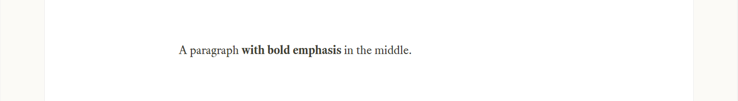
The second rule (section-std em) is used to provide bold†1 emphasis for a section of in-line text:

.section-std em {                           /* TEXT STYLE - bold */
    font-family: "eqty-ta-b";
    font-style:normal;
}

Basically, all this does is switch the font to the bold version of Equity:

    font-family: "eqty-ta-b";

eqty-ta-b is the bold version (see § 9.2) the b indicates this is the bold version of the font.

The next line:

    font-style:normal;

doesn't actually do anything, it’s just good practice, the Equity fonts do not have different styles embedded within them (see § 9.3), this just makes sure we’re not trying to use them.

To emphasise any text within a section, just use the <em> element as normal

Figure 10.3 - Using section-std em
Figure 10.3   Using section-std em
†1 Historically, the <em> element was used to provide italic emphasis — I rather confusingly re-tasked it to be bold emphasis, I thought (incorrectly as it happens) there would be more bold emphasis than italic and <em> is shorter to type. I’ve learned from my mistake, but as penance, I’m living with it.

10.3.2

The sub-title-row class

The sub-title row uses the proper responsive grid in the 1-3-1 arrangement (section 8).

    <div class="rg-row sub-title-row">                  <!-- Start of subtitle row    -->
        <div class="rg-col rg-span1-5"></div>           <!-- Left column (not used)   -->
        <div class="rg-col rg-span3-5">                 <!-- Start of subtitle column -->
            <div class="sub-title-overline"></div>      <!-- Overline                 -->
         <div class="sub-title-num-box"><h2>10.1</h2></div>
         <div class="sub-title-text-box"><h2>Section</h2></div>
        </div>                                          <!-- End of subtitle column   -->
        <div class="rg-col rg-span1-5"></div>           <!-- Right column (not used)  -->
    </div>                                              <!-- End of Subtitle row      -->

The rg classes here are just like the ones we setup in § 8.3, there is an rg-row class that holds the whole sub-title section, there are three rg-col classes (one for each of the three columns) and finally, there are the rg-span classes: rg-span1-5 for the left column, rg-span3-5 for the wide, central column and rg-span1-3 for the right column. This is a virtually identical arrangement to the one setup in section 8.3 where I explained and built the responsive grid arrangement.

The first line:

   <div class="rg-row sub-title-row">

is the container for the whole three column row, that’s what rg-row does (see § 8.3), this time it also has an addition class applied to it: sub-title-row.

The CSS behind this: sub-title-row class is pretty straight forward:

   .sub-title-row { margin-bottom: 1rem;}

It just puts some space between the sub-title row and the section proper (adds a bottom margin of 1 rem — 24 pixels at the maximum size).

The next line is the left hand column (again just like § 8.3), the left column (and the right column at the bottom) are empty:

<div class="rg-col rg-span1-5"></div>
   ...
<div class="rg-col rg-span1-5"></div>

but I still need to define them to fill the gaps and make the whole thing work properly.

The bit in between (the central column) is the important bit:

        <div class="rg-col rg-span3-5">                 <!-- Start of subtitle column -->
            <div class="sub-title-overline"></div>      <!-- Overline                 -->
         <div class="sub-title-num-box"><h2>10.1</h2></div>
         <div class="sub-title-text-box"><h2>Section</h2></div>
        </div>                                          <!-- End of subtitle column   -->

The first line just defines the column (again exactly like § 8.3), it spans the central three columns of the five column wide section:

   <div class="rg-col rg-span3-5">

Adding a dividing line

Next there is another new class: sub-title-overline:

       <div class="sub-title-overline"></div>

The CSS behind this is:

.sub-title-overline{
    margin-top: 4.7rem;
    margin-bottom: 0.5rem;
    border-top: 2px solid #404030;
}

All this does is to draw a thick line above the section number (the whole class is highlighted in blue):

Figure 10.4 - The sub-title-overline class
Figure 10.4   The sub-title-overline class

It adds a fair amount of space above the line (4.7 rem as a top margin, this is 112 pixels at the maximum width):

    margin-top: 4.7rem;

There is also a small space below the line (0.5 rem or 12 pixels):

    margin-bottom: 0.5rem;

This is just visible; there is a thin blue area below the line and above the number and title.

Next is the line itself, this is just the top border of the class:

   border-top: 2px solid #404030;

The line is 2 pixels high, is a solid line and has the same grey colour as the text (#404030).

The section title (heading)

The section title has two parts, a number (e.g. 10.2) and the title text. These are handled in the next two lines:

   <div class="sub-title-num-box"><h2>10.1</h2></div>
   <div class="sub-title-text-box"><h2>Section</h2></div>

There are also two new classes: sub-title-num-box and sub-title-text-box, the code for which is:

.sub-title-num-box {                    /* container for sub-title number */
    display: inline-block;
    float: left;
    width: 20%;
    text-align: left;
    font-family: "conc-t3-r";
    font-feature-settings: "ss02";
    font-size: 1.9rem;
    color: #404030;
}

.sub-title-text-box {                   /* container for sub-title text */
    display: inline-block;
    float: left;
    width: 80%;
    text-align: left;
    font-family: "conc-t3-r";
    font-feature-settings: "ss02";
    font-size: 1.9rem;
    color: #404030;
}
Code 10.4 CSS associated with the sub-title class

These are two very similar classes; they are both configured as inline-block elements:

   display: inline-block;

They are also configured to float to the left:

   float: left;

This means that the inline block elements will stack next to each other in a horizontal line (until they become too wide for the screen — section 6 explains how this works).

Next comes the only difference between the classes, in sub-title-num-box the width of the box is set to 20% of the column width:

   width: 20%;

and sub-title-text-box grabs the remaining 80%:

   width: 80%;

This means that the number fits in a box that is 20% of the central column width and the text of the title fits in the remaining 80%, you can see it here where I’ve applied false colouring:

Figure 10.5 - The section title number and text arrangement
Figure 10.5   The section title number and text arrangement

This screenshot was taken with the browser width greater than the maximum body size (1276 pixels), the number box (red) is 150 px wide and the text box (green) is 598 px wide. The whole central column is 748 px so these do indeed workout at 20% and 80% respectively.

The rest of each class is again identical and just defines the font for the title number and text, its size and some other textual properties (boiler plate stuff):

First I left justify the font (make the text start at the left hand side of its container, rather than centralised or pushed to the right):

   text-align: left;

Next I select the Concourse font and make sure the British stylistic set is used (see § 9.1.3), this is stylistic set ss02:

    font-family: "conc-t3-r";
    font-feature-settings: "ss02";

Finally I set the font size and the colour of the text:

    font-size: 1.9rem;
    color: #404030;

The font is set to be 190% of the normal body text size (nearly twice the height). I don’t need to make the title size responsive; this is done automatically by the fact that the body text is already responsive (§ 10.1.1), the title number and text size is relative to the body text size (1.9rem), this means that as the body text becomes smaller in response to the browser width, the title number and text also become smaller (always remaining 190% of the body text size).

The font colour is set to the standard text colour (#404030).

That’s the title styling; all that remains is entering the title information (its number and its text). This is done in the HTML with the <h2> element:

   <div class="sub-title-num-box"><h2>10.1</h2></div>
   <div class="sub-title-text-box"><h2>Section</h2></div>

The number is entered in the first line (with the sub-title-num-box class) between the <h2> and </h2> tags, 10.1 in the above example.

The title text is done in exactly the same way on the next line (with the sub-title-text-box class), again between the <h2> and </h2> tags, “Section” in the above

10.3.3

Putting content into a section

I’ve spent a long time talking about a section and so far all we’ve got is a heading with a line above it (ok, it can be a thick line or a thin line — woohoo).

The main point of having a section within a website is that it should tell us something — it needs some content and it needs somewhere to put that content.

In the HTML for the section (Code 10.2, reproduced below):

section html
<!-- **************************************************************************
     SECTION - TYPICAL SECTION (10.1)
     ***********************************************************************-->

<section class="section-std" id="js--100100">           <!-- Start of section         -->
    <div class="rg-row sub-title-row">                  <!-- Start of subtitle row    -->
        <div class="rg-col rg-span1-5"></div>           <!-- Left column (not used)   -->
        <div class="rg-col rg-span3-5">                 <!-- Start of subtitle column -->
            <div class="sub-title-overline"></div>      <!-- Overline                 -->
         <div class="sub-title-num-box"><h2>10.1</h2></div>
         <div class="sub-title-text-box"><h2>Section</h2></div>
        </div>                                          <!-- End of subtitle column   -->
        <div class="rg-col rg-span1-5"></div>           <!-- Right column (not used)  -->
    </div>                                              <!-- End of Subtitle row      -->

    <div class="rg-row">                                <!-- Start of section content -->
        <div class="rg-col rg-span1-5">                 <!-- Start of left column     -->
            <aside class="aside-left">                  <!-- Start of left side bar   -->
                <p>Optional left side bar with right justified<br>text</p>
            </aside>                                    <!-- End of left side bar     -->
        </div>                                          <!-- End of left column       -->

        <div class="rg-col rg-span3-5">                 <!-- Start of section text    -->

<p class="hyp"><span class="all-caps">Section.</span> This is a typical section, it will be numbered X.Y.</p>

                    <p class="hyp">Sections have an h2 heading level.</p>

        </div>                                          <!-- End of section text      -->

        <div class="rg-col rg-span1-5">                 <!-- Start of right column    -->
            <aside class="aside-right">                 <!-- Start of right side bar  -->
                <p>Optional right side bar with left justified<br>text</p>
            </aside>                                    <!-- End of right side bar    -->
        </div>                                          <!-- End of right column      -->
    </div>                                              <!-- End of section content   -->
</section>                                              <!-- End of section           -->
<!-- ================================================================== [WP END]      -->
Code 10.5   HTML associated with a typical section

Lines 1 to 17 define the section itself, add a title row and format the content of that row (title font, dividing line style &c.) and all of this was describe in the previous sections (§§ 10.3.1 & 10.3.2), now comes the actual content of the section. This is done in a new row within the section:

            <div class="rg-row">                                <!-- Start main content -->
                <div class="rg-col rg-span1-5">                 <!-- Start left col -->
                    <aside class="aside-left">                  <!-- Start left aside -->
<p>Optional left aside with right justified<br>text</p>
                    </aside>                                    <!-- End left aside -->
                </div>                                          <!-- End left col -->

                <div class="rg-col rg-span3-5">                 <!-- Start section -->

<p class="hyp"><span class="all-caps">Section.</span> This is a typical section, it will be numbered X.Y.</p>

                    <p class="hyp">Sections have an h2 heading level.</p>

                </div>                                          <!-- End section -->

                <div class="rg-col rg-span1-5">                 <!-- Start right col -->
                    <aside class="aside-right">                 <!-- Start right aside -->
<p>Optional right aside with left<br>justified<br>text</p>
                    </aside>                                    <!-- End right aside -->
                </div>                                          <!-- End right column -->
            </div>                                              <!-- End main content -->

This is just a responsive grid row (discussed at great length in § 8.3.1).

I’ve colour coded the next bits, the code in red is the left sidebar, the code in green is the main (central) section content and the code in blue is the right sidebar.

To give some indication of how this is associated with the section on the website, I’ve colour coded the relevant areas accordingly, it looks like this:

Figure 10.6 - The section content areas
Figure 10.6   The section content areas

I want to concentrate on the bit in the middle; I cover the asides in the next section, but just for clarity I’ll explain the column structure.

The column structure for the asides is very similar to the empty columns defined for the sub-title row:

   <div class="rg-col rg-span1-5"></div>

For the section content area it just has something in it:

        <div class="rg-col rg-span1-5">                 <!-- Start of left column     -->
            <aside class="aside-left">                  <!-- Start of left side bar   -->
               ...
            </aside>                                    <!-- End of left side bar     -->
        </div>                                          <!-- End of left column       -->

Specifically it has another sematic element called <aside>, for our purposes at the moment, the left and right asides are responsive columns that give the correct (1-3-1) spacing needed for the website.

10.3.4

The central content column

The central column is again a responsive column with classes for rg-col and rg-span3-5 just like we had in § 8.3.1

   <div class="rg-col rg-span3-5">

And that is pretty much all there is to it; the content for the section just lives in <p> elements between the opening and closing <div>, you can have as many as you want:

Here is an example (lines 27-31):

section html
<!-- ****************************************************************** [WP SECTION]
     SECTION 2.2 - AN OVERVIEW OF THE CONTROL SYSTEM
     ***************************************************************-->


<section class="section-std" id="js--020200">           <!-- Start of section         -->
    <div class="rg-row sub-title-row">                  <!-- Start of subtitle row    -->
        <div class="rg-col rg-span1-5"></div>           <!-- Left column (not used)   -->
        <div class="rg-col rg-span3-5">                 <!-- Start of subtitle column -->
            <div class="sub-title-overline"></div>      <!-- Overline                 -->
         <div class="sub-title-num-box"><h2>2.2</h2></div>
            <div class="sub-title-text-box"><h2>An overview of the control system</h2></div>
        </div>                                          <!-- End of subtitle column   -->
        <div class="rg-col rg-span1-5"></div>           <!-- Right column (not used)  -->
    </div>                                              <!-- End of Subtitle row      -->

    <div class="rg-row">                                <!-- Start of section content -->
        <div class="rg-col rg-span1-5">                 <!-- Start of left column     -->
        <!--     <aside class="aside-left">                  Start of left side bar   -->
        <!--         <p></p>                                 Side bar content         -->
        <!--     </aside>                                    End of left side bar     -->
        </div>                                          <!-- End of left column       -->

        <div class="rg-col rg-span3-5">                 <!-- Start of section text    -->

<p class="hyp">The water treatment works will be controlled by a Siemens Simatic Process Control System (PCS&nbsp;7 system). This system has four basic components, the Automation Systems (AS), the Operator Station Server (OSS) the Operator Station clients (OSC) and the Engineering Station (ES).</p>

<p class="hyp">The Automation Systems interface directly with the plant and control the plant devices (motors, valves etc.) and instrumentation (flow, level, pressure sensors etc.).</p>

<p class="hyp">The Operator Station Server (hereafter just the Server or OSS) interfaces with the Automation Systems and collates the data from those systems (instrument reading, device status, events etc.).</p>

        </div>                                          <!-- End of section text      -->

        <div class="rg-col rg-span1-5">                 <!-- Start of right column    -->
        <!--     <aside class="aside-right">                 Start of right side bar  -->
        <!--         <p></p>                                 Side bar content         -->
        <!--     </aside>                                    End of left side bar     -->
        </div>                                          <!-- End of right column      -->
    </div>                                              <!-- End of section content   -->
</section>                                              <!-- End of section           -->
<!-- ================================================================== [WP END]      -->
Code 10.6   A typical multi-paragraph section

It looks like this:

Figure 10.7 - A multi-paragraph section
Figure 10.7   A multi-paragraph section

It’s just a whole load of paragraph elements one after the other, you can have as many as you like.

You’ve probably noticed that all my paragraphs have a hyp class associated with them:

    <p class="hyp">...</p>

The hyp class doesn’t exist in the CSS; there is no .hyp in style.css.

This hyp class is used by the third party JavaScript hyphenator.js, this hyphenates the web page text on the fly when the page renders in a browser. Assigning the class hyp to a paragraph tells hyphenator.js that I want it to hyphenate that paragraph; and since I nearly always want to hyphenate text, it means that virtually all of my paragraphs start:

    <p class="hyp">

I explain how to get, configure and use the hyphenator.js software at great length in section 19. For the time being, just accept that all paragraphs in the main section content area are assigned the class hyp.

  • The alternative to hyp is nohyp, this ensures that the paragraph will not be hyphenated.

10.3.5

Left and right asides

The left and right asides are a bit like footnotes, they are designed to hold additional information that is relevant to the main body of the section. Either aside can be used and there is no right or wrong to using the left in preference to the right.

There is however a difference in how the asides behave when the columns collapse in response to narrower browser windows (see § 8.2); the left aside will collapse inline above the main section text and the right aside will collapse inline below the main section, like this:

Figure 10.8 - How the side bars behave at narrow browser widths
Figure 10.8   How the side bars behave at narrow browser widths

This can be important and depends entirely on the content of the side bar. If for example, the side bar contained some sort of title or prologue information it would be better if it came before the main content, in which case it would be in the left aside. If however, the aside was an explanation of units or an acronym, it would probably be better coming after the main content and as such should be in the right aside.

The other difference between the left and right asides is that the left aside has its text right justified, the text all lines up on the right hand side of the column with a jagged edge on the left hand side.

The right aside has its text left justified (like normal text on the website), the text lines up on the left hand side of the column and the jagged edge is on the right. This can be seen in Figure 10.8.

Basic properties of the asides

Let’s have a look at the code:

    <div class="rg-row">                                <!-- Start of section content -->
        <div class="rg-col rg-span1-5">                 <!-- Start of left column     -->
   .        <aside class="aside-left">                  <!-- Start of left side bar   -->
               <p>Optional left side bar with right <br>justified<br>text</p> 
            </aside>                                    <!-- End of left side bar     -->
        </div>                                          <!-- End of left column       -->

        <div class="rg-col rg-span3-5">                 <!-- Start of section text   -->
            ...
        </div>                                          <!-- End of section text     -->

        <div class="rg-col rg-span1-5">                 <!-- Start of right column   -->
            <aside class="aside-right">                 <!-- Start of right side bar -->
                <p>Optional right side bar with left<br>justified<br>text</p> 
            </aside>                                    <!-- End of right side bar   -->
        </div>                                          <!-- End of right column     -->
    </div>                                              <!-- End of section content  -->

The HTML is fairly simple; there is the standard column declaration:

   <div class="rg-col rg-span1-5">

This is the same for both the left and right asides; it simply defines a responsive grid column with a span of 1 column in a 5 column arrangement (see § 8.3.1).

Next comes a semantic element, the <aside> element. This is given the class aside-left for the left aside and aside-right for the right aside.

The CSS code behind these classes is:

section cssl
.aside-left,                                /* container for side bars */
.aside-right,
.aside-head {
    font-family: "conc-t3-r";
    font-feature-settings: "ss02";
    font-size: 0.85rem;
    line-height: 1.40;
    margin-top: 0.14rem;
}
.aside-left,
.aside-head  {                               /* change justification */
    text-align: right;
    padding-left: 0.7em;
}
.aside-right {
    text-align: left;
    padding-right: 0.7em;
}


.aside-left p,                              /* TEXT STYLE - paragraph */
.aside-right p,
.aside-head p {
    color: #707070;
}
.aside-left em,                             /* TEXT STYLE -bold */
.aside-right em,
.aside-head em {
    font-family: "conc-t3-b";
    font-feature-settings: "ss02";
}
.aside-head h2 {
    font-family: "eqty-ta-bi";
    font-size: 1.3rem;
    margin-top: -0.45rem;
    line-height: 1.40;
}
Code 10.7   CSS classes for the asides

At this point, you might be wondering what the aside-head class is, we haven’t seen that yet; I use it to give a heading in the side bar, it’s used in lead-in sections:

Figure 10.09 - An aside heading
Figure 10.09   An aside heading

Using the left aside for headings gives quite a nice effect; I typically use it for lead-in sections; these section do not have their own section number and title. I cover this in more detail in § 10.4).

Ok, going through the code; the first bit just defines some common properties that apply to all three classes, aside-left, aside-right and aside-head:

.aside-left,                                /* container for side bars */
.aside-right,
.aside-head {
    font-family: "conc-t3-r";
    font-feature-settings: "ss02";
    font-size: 0.85rem;
    line-height: 1.40;
    margin-top: 0.14rem;
}

I set the font to the sans-serif Concourse font:

    font-family: "conc-t3-r";

This gives a nice contrast to the main content (the body text in the main content area is a serif font, Equity),

I also use the British stylistic set (see § 9.1.3):

    font-feature-settings: "ss02";

The aside text is smaller than the main body text; I’ve set it to be 85% (0.85 rem) of the body text height, I’ve also adjusted its line spacing to be 140% of the text height:

    font-size: 0.85rem;
    line-height: 1.40;

Finally, I’ve added a top margin of 0.14 rem:

    margin-top: 0.14rem;

The reason for this is to make the baseline of the first line of the aside line up with the base line of the first line of the main content; I show it here in close-up:

Figure 10.10 - Lining up the baselines
Figure 10.10   Lining up the baselines

The orange line is set at the baseline of the main body text (starting with SECTION), the baseline of the aside is also on this line. By adding a top margin it pushes the aside text down slightly.

If I didn’t do this (if there were no top margin specified) it would look like this:

Figure 10.11 - The aside if no top margin is applied
Figure 10.11   The aside if no top margin is applied

Here the aside text is aligned with the top of the main body text and is positioned higher than the main body text baseline. It’s a small point, but the version with the margin is right (Figure 10.11) and the last one is wrong (Figure 10.12), yes I am that pedantic.

Now for the differences:

.aside-left,
.aside-head  {                               /* change justification */
    text-align: right;
    padding-left: 0.7em;
}
.aside-right {
    text-align: left;
    padding-right: 0.7em;
}

The aside-left (and the aside-head, which would only appear on the left) are both given right justification:

    text-align: right;

I also add some padding to the left hand edge to stop the text butting up next to the edge of the body area; it leaves some white space down the left hand edge.

    padding-left: 0.7em;

For the aside-right, these settings are reversed

    text-align: left;
    padding-right: 0.7em;

The text is left justified and the padding is on the right hand edge.

Paragraphs and emphasis within the asides

Next I use the descendent selectors within the aside classes to assign properties to the paragraph <p> and emphasis <em> elements within the asides.

All I do with the paragraph element is set the text colour:

.aside-left p,                              /* TEXT STYLE - paragraph */
.aside-right p,
.aside-head p {
    color: #707070;
}

I set it to the lighter grey colour #707070 (visible in Figure 10.12); again this gives contrast to the main body text.

The <em> element, when used in the main body text, makes the text bold, it uses the font eqty-ta-b (see § 10.3.1), this is a serif font (Equity). If I were to use the <em> element in the aside, it also would use the eqty-ta-b font, unfortunately the asides use the sans serif font Concourse, and when I use the <em> element in a sidebar I want it to use the bold version of the Concourse font. To do this, I’ve applied a descendent selector modification to the <em> element within the asides:

.aside-left em,                             /* TEXT STYLE -bold */
.aside-right em,
.aside-head em {
    font-family: "conc-t3-b";
    font-feature-settings: "ss02";
}

This time the <em> element will use the Concourse bold font conc-t3-b and will also apply the British stylistic set (ss02).

The aside heading style

Finally, I apply formatting to the <h2> heading in the aside-head style. Where I use the sidebar to hold a heading, I made the decision that the heading would always be a <h2> sub heading (I reserve the <h1> heading for chapter titles, see § 11.4). Again I do this with a descendent selector, and there is a bit of buggering about to go with it:

.aside-head h2 {
    font-family: "eqty-ta-bi";
    font-size: 1.3rem;
    margin-top: -0.45rem;
    line-height: 1.40;
}

First bits easy, I use the Equity bold italic font (eqty-ta-bi) and I make it a bit bigger than the normal body text (1.3 rem):

    font-family: "eqty-ta-bi";
    font-size: 1.3rem;

Next I adjust the top margin, this is for the same reason that I did it with aside-left and aside-right, it’s to make the aside <h2> heading baseline line up with the main content body text baseline (Figure 10.11 & Figure 10.12). The difference this time is that the margin-top value is negative:

    margin-top: -0.45rem;

“How can you have a negative margin?” you ask. Well you can, it simply moves the text up above its normal starting point (where it would be if the margin were zero). It’s a useful technique.

I’ve used it here because the <h2> text in the side bar is bigger than the body text in the main section (1.3 rem bigger), this means that, if I did nothing, the top of the <h2> text and the main body text would line up, and since the <h2> text is bigger its base line would be lower down the page than the body text. Hence the negative top margin, it moves the <h2> text up a bit until the baselines align with each other.

Finally, the line spacing, this again is set to 140%.

    line-height: 1.40;

10.3.6

Making the asides responsive

“What’s he banging on about now?” you’re probably wondering “the sidebars are already responsive, that what all those rg classes are for, we did that in section 8”.

Well, yes, you are quite right; the sidebars are responsive, they will collapse exactly as shown in Figure 10.9, without us having to do anything else. The trouble is I want them to look a bit different when they collapse; I want to do this so that it’s obvious that the collapsed asides are different to the normal body text. This is what my asides look like when they collapse (brace yourself):

Figure 10.12 - Collapsed sidebars
Figure 10.12   Collapsed sidebars (responsive)

Here’s the before and after version:

Figure 10.13 - Uncollapsed sidebars
Figure 10.13   Uncollapsed sidebars
Figure 10.14 - Collapsed sidebars
Figure 10.14   Collapsed sidebars

If I didn’t modify the responsive behaviour it would look like this:

Figure 10.15 - Collapsed sidebars without any customisation
Figure 10.15   Collapsed sidebars without any customisation

It’s not quite right, all that left and right justification screws it up.

I get around this with another of those @media things:

section cssl
.aside-left,                                /* container for side bars */
@media all and (max-width:520px){
    .aside-left,
    .aside-right {
        font-size: 1rem;
        width: 80%;
        margin-left: 10%;
        margin-bottom: 1rem;
        background-color: #f8f8f8;
        border: 1px solid #cccccc;
        padding: 1em 1em 0 1em;
        text-align: left;
    }
    .aside-left { border-left: 4px solid #cccccc; }
    .aside-right { border-right: 4px solid #cccccc; }
    .aside-head {
        font-size: 1rem;
        margin-left: 0;
        padding-left: 0;
        margin-bottom: 1rem;
        text-align: left;
    }
Code 10.8   Responsive CSS for the asides

So what does all this do?

The first bit works out if the browser is 520 pixels wide or less (the point at which the columns collapse, § 8.3.6):

@media all and (max-width:520px){

If the browser is 520 pixels or less in width then I make some changes to the common properties of the two main aside classes (aside-left and aside-right):

    .aside-left,
    .aside-right {
        font-size: 1rem;
        width: 80%;
        margin-left: 10%;
        margin-bottom: 1rem;
        background-color: #f8f8f8;
        border: 1px solid #cccccc;
        padding: 1rem 1rem 0 1rem;
        text-align: left;
    }

First I make the font bigger

        font-size: 1rem;

It was 85% of the main body text size, now I make it the same.

Next I make the sidebar area 80% of the browser window and centralise it by adding a 10% margin to the left (this leaves by default, 10% on the right, centralising the area):

        width: 80%;
        margin-left: 10%;

I also add a bottom margin to put some space between the collapsed sidebar and the following main content text:

        margin-bottom: 1rem;

The next thing is to make the background a light grey colour and surround the whole collapsed sidebar with a border:

        background-color: #f8f8f8;
        border: 1px solid #cccccc;

The background colour is #f8f8f8 and the border is 1 pixel wide and is on all four edges of the sidebar area.

To give some clearance between the border and the sidebar text I add padding to the top, right and left of the text:

        padding: 1rem 1rem 0 1rem;

I don’t need to add padding at the bottom, this is taken care of with the paragraph spacing that is already set up (§ 10.3.1†2)

Finally, I make all the text left justified (irrespective of whether the sidebar was originally on the left or right), when sidebars collapse, the text should always be left justified:

        text-align: left;
†2 The paragraph spacing was defined as a bottom margin for the section-std p element, this applies to the aside paragraphs too, these are all within the section-std class and that particular property for aside paragraphs has not been change in the subsequent aside classes..

Enhancing the borders

In Figure 10.13, the collapsed left sidebar has a thicker border on the left hand side (indicating it was a left sidebar); the collapsed right sidebar has a thicker border on the right (indicating it was a right sidebar).

At the moment, our sidebars have a 1 pixel thick border on all side, to change this, another responsive rule is required:

    .aside-left { border-left: 4px solid #cccccc; }
    .aside-right { border-right: 4px solid #cccccc; }

These rules are still within the initial instruction (count the squiggly brackets):

@media all and (max-width:520px){

The first line makes the left border of the aside-left class thicker (four pixels instead of one).

The second line does the same thing to the right border of the aside-right class.

Adjusting the heading

If a sidebar heading has been used, I want it to look like a proper heading when the columns collapse at low browser widths, it looks like this:

Figure 10.16 - Collapsed sidebar heading
Figure 10.16   Collapsed sidebar heading

The “a note by the author” is the sidebar heading collapsed in above the main content area.

The code behind this is pretty much more of the same; again it is within the @media rule for the sidebars.

    .aside-head {
        font-size: 1rem;
        padding-left: 0;
        margin-bottom: 1rem;
        text-align: left;
    }

First thing is to make the font the same height as the body text.

        font-size: 1rem;

Next I remove the 0.7 rem left side padding to make the heading align with the left hand side of the body text. I also add some additional spacing at the bottom (1 rem) to make it look like a proper title.

        padding-left: 0;
        margin-bottom: 1rem;

Finally, I set the text to be left justified (the heading text was originally right justified before the columns collapsed).

        text-align: left;

10.3.7

What if I don’t want to use sidebars?

It is fair to say that sidebars are mostly not used; I only used sidebars occasionally to add additional information to the main content. It is also very unusual to use both left and right sidebars at the same time.

Even if a sidebar is not used, the column still needs to be there (the <div class="rg-col rg-span1-5">). The easiest way to get rid of a side bar is just to remove the <aside> elements and everything in between; thus the Code 10.6 fragment without sidebars would become (I’ve highlighted the empty sidebar areas in green):

section html
<!-- ****************************************************************** [WP SECTION]
     SECTION 2.2 - AN OVERVIEW OF THE CONTROL SYSTEM
     ***************************************************************-->


<section class="section-std" id="js--020200">           <!-- Start of section         -->
    <div class="rg-row sub-title-row">                  <!-- Start of subtitle row    -->
        <div class="rg-col rg-span1-5"></div>           <!-- Left column (not used)   -->
        <div class="rg-col rg-span3-5">                 <!-- Start of subtitle column -->
            <div class="sub-title-overline"></div>      <!-- Overline                 -->
         <div class="sub-title-num-box"><h2>2.2</h2></div>
            <div class="sub-title-text-box"><h2>An overview of the control system</h2></div>
        </div>                                          <!-- End of subtitle column   -->
        <div class="rg-col rg-span1-5"></div>           <!-- Right column (not used)  -->
    </div>                                              <!-- End of Subtitle row      -->

    <div class="rg-row">                                <!-- Start of section content -->
        <div class="rg-col rg-span1-5"></div>           <!-- Left column              -->

        <div class="rg-col rg-span3-5">    <!-- Start of section text area -->

<p class="hyp">The water treatment works will be controlled by a Siemens Simatic Process Control System (PCS&nbsp;7 system). This system has four basic components, the Automation Systems (AS), the Operator Station Server (OSS) the Operator Station clients (OSC) and the Engineering Station (ES).</p>

<p class="hyp">The Automation Systems interface directly with the plant and control the plant devices (motors, valves etc) and instrumentation (flow, level, pressure sensors etc.).</p>

<p class="hyp">The Operator Station Server (hereafter just the Server or OSS) interfaces with the Automation Systems and collates the data from those systems (instrument reading, device status, events etc.).</p>
        </div>                                          <!-- End of section text      -->

        <div class="rg-col rg-span1-5"></div>           <!-- Right column   -->
    </div>                                              <!-- End of section content   -->
</section>                                              <!-- End of section           -->
<!-- ================================================================== [WP END]      -->
Code 10.9   A typical multi-paragraph section without sidebar content

Alternatively, the <aside> element can just be commented out:

    <div class="rg-row">                                <!-- Start of section content -->
        <div class="rg-col rg-span1-5">                 <!-- Start of left column     -->
        <!--    <aside class="aside-left">                   Start of left side bar   -->
        <!--       <p></p>                                   Side bar content         -->
        <!--    </aside>                                     End of left side bar     -->
        </div>                                          <!-- End of left column       -->

I tend to do the latter; it makes it more obvious what to do if you want to put the sidebar back in.


End flourish image