6.4
A simple layout
Let’s build a simple layout for the current website that makes it look more like a proper website. The simple layout will have four boxes:

The container box is simply a box that holds everything else and will be a fixed width of 960 pixels (there will be no specification of height; it will simply be as high as it needs to be).
- 960 px is a fairly standard width for a website and has been for quite some time; given the advent of larger screen sizes, this is now increasing and for the proper website we will use 1276 px (see § 3.3.1). For our purposes 960 will do.
The main content will hold the headings, logo and lorum ipsum paragraphs, the side area we haven’t done yet and the author and other information will hold Henry’s picture and his name.
The boxes are constructed using the <div>...</div> element. The first box we need is the container, and since this holds everything on the web page it starts just after the body start tag and ends just before the body end tag:
    <body>
        <div class="container">
            <h1>My First Blog Post</h1>

            <h2>This is my first blog post</h2>
            . . .
            <p class=author-text>Henry Gledhill</p>
        </div>
    </body>
</html>
| Code 6.4 index.html (adding container) |
All the website content that we have written so far is now contained inside the <div> element. This has absolutely no effect on the website in the browser; this is because we have not yet defined the class .container, so let’s do just that:
.author-text{
    font-size: 22px;
}

.container {
    width: 960px;
    background-color: #D8D8D8;
}
| Code 6.5 style.css (adding container) |
The background colour is just to help us identify the container area (we’ll take it out at the end).
Ok, now we’ve got a website that doesn’t fill the width of the browser window (unless the browser window is less than 960 px).
It’s not quite what we want, it would be better if the page was in the centre of the browser window (at the minute it’s over to the left). So let’s add a bit more code:
.container {
    width: 960px;
    margin-left: auto;
    margin-right:auto;
    background-color: #D8D8D8;
}
| Code 6.6 style.css (Centred web page) |
This gives an even white gap down either side:
Setting the left and right margins to auto will keep the container box centred in the web browser window (irrespective of how wide the browser becomes).
Now we’ll add the three internal boxes:
The main-area div needs to start just after the container div and ends just before the Henry image.
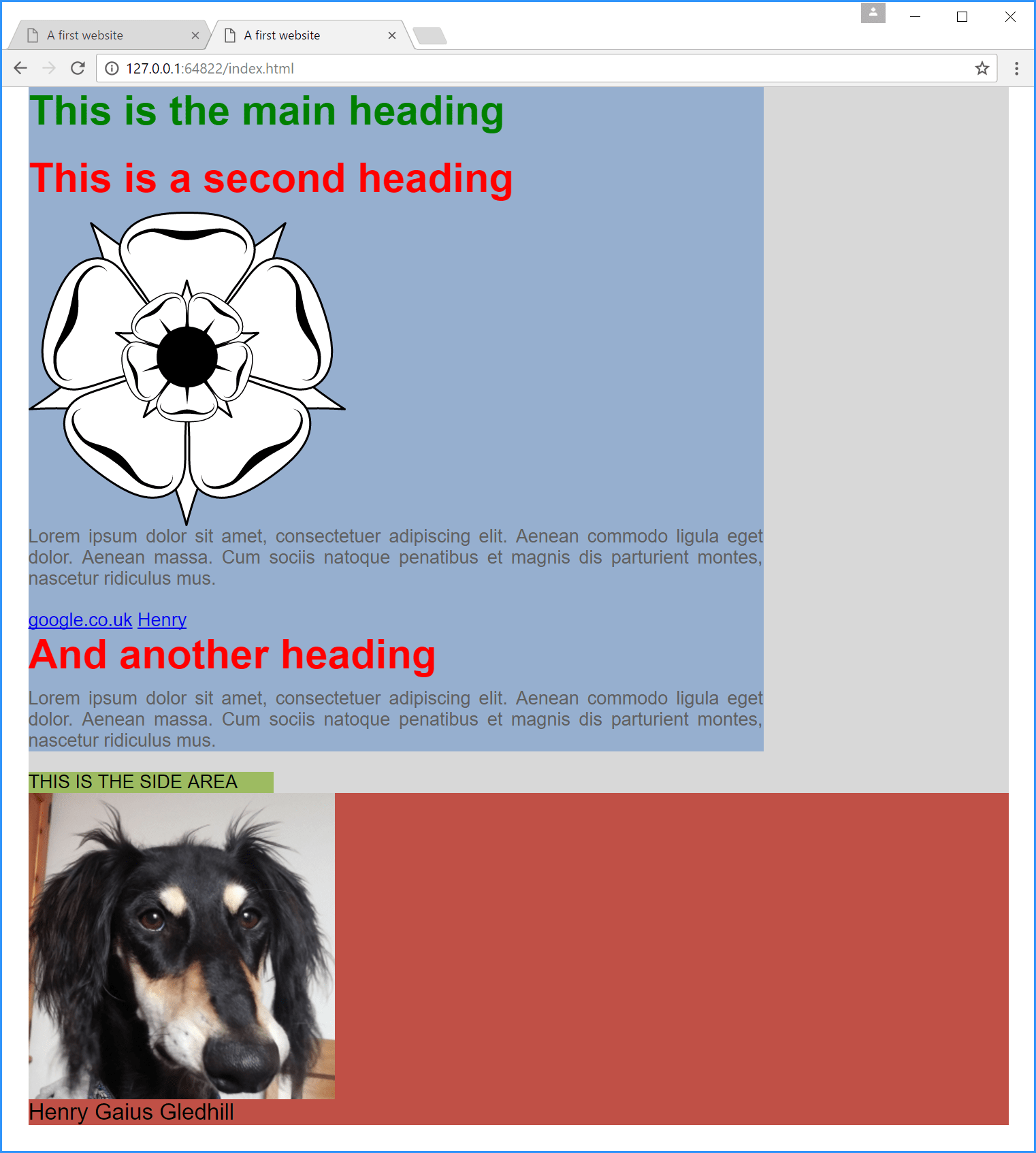
Add the side-area div just after this, add the “THIS IS THE SIDE AREA” text and then the closing div (we’ll come back to this).
Put the author-box div around the Henry image and Henry Gaius Gledhill paragraph. The whole this should look like this:
<!DOCTYPE html>
<html>
     <head>
        <title>A first website</title>
        <link rel="stylesheet" type="text/css" href="style.css">
    </head>

    <body>
        <div class="container">
            <div class="main-area">
                <h1>This is the main heading</h1>

                <h2>This is a second heading</h2>

                <img src="logo.svg" alt="The website logo">

<p class="main-text">Lorem ipsum dolor sit amet, consectetuer adipiscing elit. Aenean commodo ligula eget dolor. Aenean massa. Cum sociis natoque penatibus et magnis dis parturient montes, nascetur ridiculus mus.</p>

<a href="http://www.google.co.uk" target="_blank"> google.co.uk</a>

                <a href="henry.png">Henry</a>

                <h2>And another heading</h2>

<p class="main-text">Lorem ipsum dolor sit amet, consectetuer adipiscing elit. Aenean commodo ligula eget dolor. Aenean massa. Cum sociis natoque penatibus et magnis dis parturient montes, nascetur ridiculus mus.</p>
            </div>

            <div class="side-area">
                THIS IS THE SIDE AREA
            </div>


            <div class="author-area">
                <img src="henry.png" alt="Henry the saluki">

                <p class="author-text">Henry Gaius Gledhill</p>
            </div>
        </div>
    </body>
</html>
| Code 6.7 index.html (adding interior boxes) |
And now the CSS; add the following classes to the end of the file:
.main-area {
    background-color: #96AFCF;
}
.side-area {
    background-color: #9DBB61;
}
.author-area {
    background-color: #C05046;
}
| Code 6.8 style.css (adding interior boxes) |
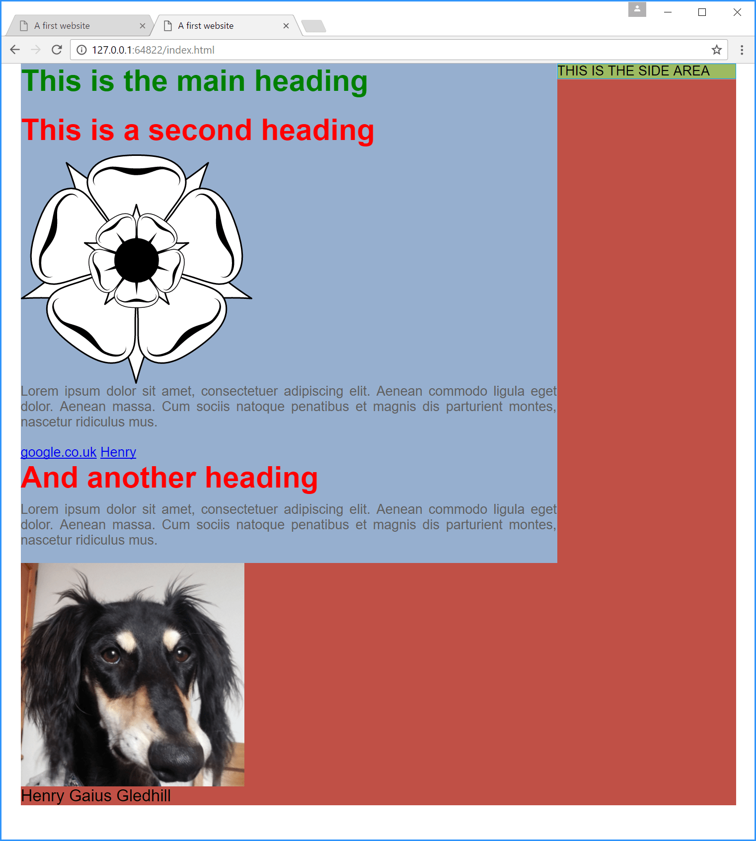
Again, the colours just let us see where each box is on the screen
Right, well we’ve got all the boxes, just not in the right place.
The first thing to do is to make the blue and green boxes the correct width; in Figure 6.6 the blue box is 75% of the width and the green box is 25% of the width. This is an easy change to make; the width property sets the width of a box:
.main-area {
    background-color: #96AFCF;
    width: 75%;
}
.side-area {
    background-color: #9DBB61;
    width: 25%;
}
| Code 6.9 style.css (set box width) |
And we get:
Yep, it’s going to be a long day.
Next: the reason the boxes are still on top of each other is because we haven’t told them to behave in another way (remember, block elements always start on a new line). The command we are looking for is the float command, in this case we will make both the blue and green boxes float to the left hand side of the main (grey) container
- The blue and green boxes together add up to 100% of the width of the container box, so it doesn’t matter that both the blue and green float left, the green box could float right, it would still fill the available space
.main-area {
    background-color: #96AFCF;
    width: 75%;
    float: left;
}
.side-area {
    background-color: #9DBB61;
    width: 25%;
    float: left;
}
| Code 6.10 style.css (with float) |
Bet that fixes it.
Well, not so much. The blue and green boxes have done the right thing. The red box is all over the place.
This is a common problem with CSS, the float instruction is a bit like the genie: once you’ve used it it’s hard to put it back in the bottle.
To get round this we use a clever bit of jiggery-pokery (that to be honest I’m not sure I fully understand). We use the clearfix hack: